Posted: May 30th, 2010 | No Comments »
In the concluding chapter of my PhD thesis, I stepped back from the contributions and contemplated their implications. I entitled one section “From data-driven urbanism to human/data-based urbanism”, in which I set some of the limitations of my work:
However, there is a big assumption in seeing the world as consisting of bits of data that can be processed into information that then will naturally yield some value to people. Inspired by Julian’s *-computing. [...] the understanding of a city goes beyond logging machine states and events. In consequence, let us not confuse the development of novel maps from previously uncollectable and inaccessible data with the possibility to produce “intelligent maps”.
Taken this caution into account, I argue for the necessity to mix quantitative and qualitative data to build knowledge on a city/building/shared space, our relations with it and its infrastructures. Both types of data con feed inductive and deductive methods:
The qualitative analysis to inform the quantitative queries: This approach first focuses on people and their practices, without the assumption that something computational or data process is meant to fall out from that. This qualitative angle can then inform a quantitative analysis to generate more empirical evidences of a specific human behavior or pattern. [...]
The quantitative data mining to inform the qualitative enquiries: In that approach, the quantitative data help to reveal the emerging and abnormal behaviors, mainly raising questions. The qualitative angle then can help explaining phenomenon in situation. The qualitative approaches actually requests to ask the right questions to learn anything meaningful about a situation. [...]
So, I was particularly pleased with recent’s Big Data: Opportunities for Computational and Social Sciences in which Danah Boyd acknowledges the tremendous opportunities “Big data” creates in social sciences, but, analogously to my conclusion, she points out the limitations of computational scientists in the “web science” domain:
Just because you see traces of data doesn’t mean you always know the intention or cultural logic behind them. And just because you have a big N doesn’t mean that it’s representative or generalizable. Scott knows this, but too many people obsessed with Big Data don’t.
One major problem when it comes to “large archives of naturalistically-created behavioral data” is their “subjectivity” or the “hidden intentions” behind them (see “Embracing the Subjectivity of Georeferenced Photos“) or as Danah argues “Just because you see traces of data doesn’t mean you always know the intention or cultural logic behind them“. Grasping the value in subjective data is still a concept computational scientists must get the mind around, and I doubt they will be able to do alone in their research communities.
Besides data analysis methods, creativity comes to play in collecting both precise and relevant data for mixed methods. For our current investigation on hyper-congestion at the Louvre Museum, at a very early stage we thought of integrating observations of the surveillance team to help explain phenomena quantitative data analysis reveal.

A surveillance staff member as a source of information to explain phenomena quantitative data analysis reveal.
Why do I blog this: My PhD thesis taught me that patterns invite more questions than they answer. On the field, to answer questions, there is necessity to know how to mix quantitative with qualitative methods. So also The “Quants”, their Normalizations and their Abstractions.
Posted: May 30th, 2010 | No Comments »
This week opened the HABITAR exhibition at LABoral Centro de Arte y Creación Industria as part of their Mediatica Expendida, a space dedicated to new forms of distribution and access to art. I had the please to contribute to this project as conceptual advisor collaborating with curator José Luis de Vicente to define a walk through emerging ideas, solutions, languages that define a new urban landscape. This walk showcases the creative process of artists, designers, engineers, hybrid researchers that now jostle with the practices of architects and city planners.
LABoral proved to provide the best support for an interdisciplinary forum for dialogue that foster this new urban framework. As described by Benjamin Weil, Chief Curator at LABoral: “The presentation of projects functions as a Demo, as a 3D documentary, and at times as a more classical exhibition. The experience of data is core to the curatorial premise, as a mean to reflect upon the notion of exhibition space“. The spatial designers Longo + Roldán proved particularly good at that game.
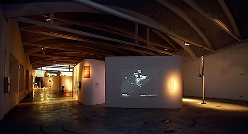
The HABITAR exhibition space at LABoral. Photo courtesy of Edgar Gonzalez
The journey into HABITAR starts with the account of the city as a built space that is increasingly being replaced by that of a set of dynamic processes and human flows superimposed onto its physical infrastructure. As architects move away from working with plans and towards working increasingly with words and narrative, their output is measured in terms of ideas more than structures. In addition, with physical infrastructures now complemented, governed and even replaced by information systems, new ideas, solutions, languages from different practices have emerged. From the 17 contributions exhibited, José Luis and I wanted to communicate some implications. Here is my perception with an attempt to categorize and link them.
The code altering people’s experience of the urban space
The wireless infrastructure subtly highlighted in Wireless in the World (2009) project fashions sentient and reactive environments through information layers that are integrated into the actual design of physical space. In Wi-Fi Structures and People Shapes (2009), the analyses of how the fluctuations of wireless signals can be mapped onto the informal use of space. The sketches reveal how users interact with the wireless space and elements like furniture that were provided for them as part of the investigation. These new forms of dwelling the space governed by ubiquitous computing and hyper-connectivity also produce counter-reactions with emerging defensive skills and solutions. Hacking public space therefore becomes an integral part of the way it is being used and is therefore mapped out. The Sentient City Survival Kit (2010) does a great job in raising the awareness of the implications for privacy, autonomy, trust and serendipity in this highly observant, ever-more efficient and over-coded city.
Wi-Fi Structures and People Shapes. Peaks indicate good signal strength; troughs indicate poor signal strength. Image courtesy of cityofsound.
Capturing and rendering the dynamics of the city
First, the vision of the city as a historical conglomerate of buildings and infrastructure is augmented with dynamic visions of the city that include its information networks, mobile technologies, the increasing mobility of citizens, and the presence of environmental parameters such as air quality, noise levels and stress factors. The exhibition features several of MIT SENSEable City Lab‘s pioneer works in the domains of space definition. Locutorio Colón (2005-2006) and Time Out of Place (2007), are examples form the worlds of designers and artists to captured and rendered mobilities with local and global relationships. These works reveal the necessity to further push the boundaries in the use of aesthetics as part of a collaborative research process Visualizing Lisbon’s Traffic (2010) (as part of the MIT Portugal research program) and engage on key issues such as In the Air (2008-2010).
The multiple points of view and angles of participation
Besides grasping and beautifying urban dynamics, projects aimed highlighting the multiple facets of one urban reality. For instance the researchers at MIT SENSEable City Lab developed prototypes to understand the “removal-chain” as the industry does for the “supply-chain”. Similarly, the Near Future Laboratory, shipped to Gijon their apparatus for capturing other points of view. This 24 foot pole was used in an experiment to visually describe time, movement, pace, scales of speed and degrees of slowness of flows in urban spaces. What strikes in these works is the diversity of angles of approaches of technological initiatives that relate to the urban life. The exhibition features the processes project conceived to encourage the creation, development and collaboration with an impact on the city. UrbanLabs “based on the philosophy and collaborative methods of free software, it brings together –on-site and online– a range of citizens, entrepreneurs and creative agents who are working on solutions and digital services in the field of communication, mobility, decision taking, geo-localisation, leisure, sustainability, cooperation and city planning“. Also from Spain, the BCNoids (2008-2010) project that reveals Barcelona from its Bicing system was developed by architecture students as part of the Visualizar workshop series at Media-Lab Prado.
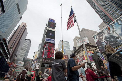
24 foot pole was used with 2 recording cameras mounted on top of it, an urban scout equipment developed by the Near Future Laboratory. Photo courtesy of JulianBleecker.
Climate and its protection as architecture’s new terrains of investigation
These new angles of approach at the crossroads of geography, sociology, design, art and grassroots initiatives tend to redefine the way we can envision the city, its dynamics, its buildings and spaces. They try to take into account the new needs and preoccupations of today’s heterogeneous citizenship that share a common space and for Benjamin Weil to wonder “it is possible that the various experiments featured in Habitar demonstrate the limit of the modernist utopia“. The practice of architecture has been exploring new terrains such as investigating more uses or options to existing building’s design as featured in the Mutant Bridges (2010) project. Meteorological Architecture (2010) sets another goal of architecture to look for the balance with climate and its protection and suggests the possibility for for climate to become the resources and tools of architecture. Based on digital design and new technologies for customized fabrication, Fab Lab Solar House (2009-2010) is the first completely self-sufficient solar house in Barcelona.
Fab Lab Solar House at HABITAR. Photo courtesy of Edgard Gonzalez.
Why do I blog: Contributing as advisor and curating some aspects of the exhibition was a worthwhile experience to further grasp the role of architecture at the time of urban informatics. The HABITAR catalog includes 8 essays from the curator José Luis and I are particularly eager to share online. The contributors include Benjamin Weil, Molly Wright Steenson, Bryan Boyer, Usman Haque, Anne Galloway, Nicolas Nova and José Pérez de Lama. More on that later….
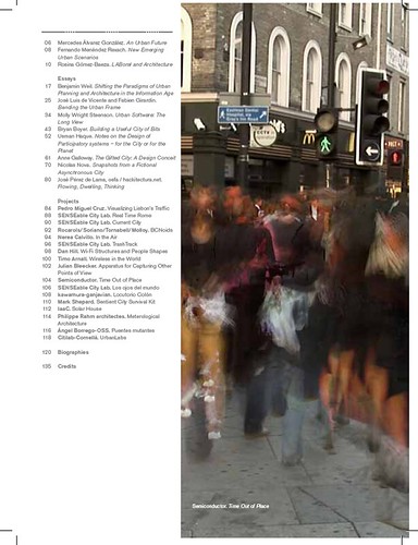
Table of contents of the HABITAR catalogue. More on that later….
Posted: May 26th, 2010 | No Comments »
Since Tracing the Visitor’s Eye, back in 2007, several projects have emerged with more stunning and large scale maps of georeferenced photos in Flickr, Picasa, Panoramio or Getty Images. Some visualize the density of photos to describe the spaces (e.g. World touristiness map, Mapping the Cultural Buzz, 24 Hours of Geotagged Photos) while other exploit the timestamp embedded in each photo EXIF to extract individual paths (e.g. Mapping the World’s Photos, Image Sequence Geolocation with Human Travel Priors), flows (e.g. The World’s Eyes) and even infer the mode of transportation (e.g. The Geotaggers’ World Atlas).

New York City from Eric Fischer‘s beautiful Geotaggers’ World Atlas.
These works display the enormous creative skills and sense of aesthetics of their developers. In a pure “urban demo” approach, their storytelling power serves as alibi to attract attention, stimulate the dialogue and stretch the imagination (see Below the Tip of the Urban Data Iceberg).
Yet, a second generation of exploration of these georeferenced photos has yet to take place; the type of investigation that creates value and knowledge beyond a pure narrative and the fascination of beautiful visualizations. I explain this slow evolution to extract ourselves from.
First, some of the narratives describing these projects aim for objectivity rather than fully embracing the subjectivity of the data. In my research work, I considered that uploading, tagging and disclosing the location of a photo was an act of communication rather than a pure implicit history of physical presence. Therefore, these data are not comparable to absolute values of the presence of photographers and tourists as it is easy and useful to narrate with these visualizations. Rather, the data give indications about the places/events/environments web-sharing platform like sharing. An example of knowledge extraction from georeferenced data is Neighborhood Boundaries by Tom Taylor that exploit Flickr Shapefiles to define neighborhoods from human perceptions.
Second, these works do not place under scrutiny the evolution of subjective layers or digital strata accumulated over the last years. When samples are extracted, cleaned, normalized and analyzed, they can give indications on the evolution of places/events/environments. Our work in the Summer 2008 around the NYC Waterfalls come to my mind to exemplify the value of temporal layers (see Quantifying urban attractiveness from the distribution and density of digital footprints). In this work, we compared over 3 years the flows photographers present in lower Manhattan. With a centrality indicator, we could reveal that the year of the Waterfalls, the waterfront became more central in the routes based on what photographers like to share. This work delivered a quantifiable indicator to evaluate an urban strategy extracted from a subjective dataset.
Why do I blog this: Noticing a surge of new visualizations of georeferenced photos, when the moment might have come to produce a new generation of investigation, to create and share knowledge out of theses masses of data. It will be the theme of the upcoming Lift France 10. The ability to attract the attention with visualizations is part of the new data scientist skillset. On the other hand, grasping the value in subjective data is still a concept we must get our mind around. To be discussed at Lift in Marseille.
Posted: May 20th, 2010 | No Comments »
Today, I participated to the 12th edition of the BDigital Global Congress in a session on “Smart” Cities. As I genuinely believe that cities are by definition “smart”, I had no conceptual models to propose. Nevertheless, in a brief talk, I intended to communicate notions that I am more comfortable with; focusing on details rather than big pictures. My message crystalized on the opportunity to exploit the data soft infrastructures produce. In the recent years, a first generation of projects mapped network data to raise awareness on city dynamics. At Lift Lab, we are conducting a second generation of investigation that further exploits the value of these data. We are devoting our attention to the production of metrics and indicators from network data. To explain our approach, I presented two case studies that examplify how indicators can integrate space management strategies (assess strategies in New York) and tackle some frustrations of daily life (indicators that measure the hyper-congestion in the Louvre Museum).
Download the slides + notes.

Why do I blog this: This congress was an opportunity to confront some of our maturing concepts on indicators and collect feedback on their implications and applications.
Posted: May 13th, 2010 | No Comments »
There is an unwritten rule when fast prototyping that says that “one should know when to stop”. It is executed making up a deadline, fixing a scope and sticking to them. Last week’s Lift Conference marked the end of a fast prototyped pet project that contributed to this year’s theme “connected people” with an interactive map of Geneva from its social network activity.
The result highlights photogenic areas (e.g. lakefront, old town, parks) and events (Geneva Motor Show, Geneva Festival) based on the analysis of 3070 photos georeferenced by 1237 Flickr users over a full year. These persistent longitudinal measures (see Adam Greenfield’s description of the Long Here) are overlaid with the location of the most checked-in places in Foursquare within the week of the Lift Conference (see Adam Greenfield’s description of the Big Now). This (almost) immediate checkin-in trend acted as invitations to explore or rediscover Geneva.
This work is now archived (see Geneva From its Social Network Activities) and the milestones documented in Flickr.
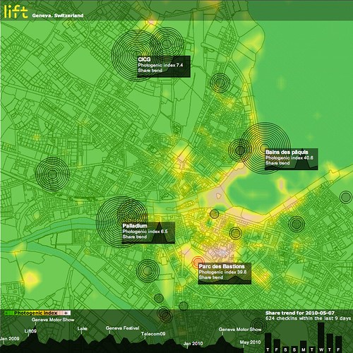
Through data analysis and visualization techniques, we produced an interactive map of the city, revealing photogenic areas (e.g. the lakefront) with public places (e.g. Bains des Pâquis, Parc des Bastion) and events (e.g. Geneva Motor Show, Geneva Festival, and of course Lift at CICG) people like to share online. Screenshot of Friday May 7, 2010, at the end of the Lift conference that took place at CICG in Geneva.
During the conference, I was asked a several times for the reasons and the technicalities behind the development of this prototype.
My approach to fast prototyping looks further than building preliminary models or patterns later applicable to full-scale developments. Instead, I integrate fast prototyping to my hybrid research process in which the exploration equals the value of the result. Indeed, prior to any result, the prototype helps support the reasons of the investigation and build arguments of its significance. More concretely, if I ever had to legitimize this work, here are a few details on the “why” and how” I have developed this visualization:
Prototyping to learn new skills and techniques
A first reason to prototype is to learn something, particularly in the development of new skills and techniques. In favorable fast prototyping conditions there is a dose of freedom that do not constraint to particular technologies. In this project, I explored what I believed where the best techniques to build each element of the data visualization. In details:
Data collection:
I integrated my pre-existing Java module to connect to the Flick API with the flickrj library. The Foursquare data were regulatory collected with a simple Python scripts that used the Python Library for the Foursquare API.
Data management and analysis:
A banal MySQL database fed data to R, a statistical software that no one never masters enough. In addition to my current set of scripts, I particularly toyed with the ggplot2 plotting system to work on the heatmap (see ggplot2: Quick Heatmap Plotting). I also thoroughly browsed the R Spatial Projects with to find attractive graphic solutions, but ended up using filled.contour because it was producing the most detailed results. As part of my idea to reveal Foursquare territories, I employed the tripack package to produce Voronoï “maps”. I abandoned this exploration after two iterations, as the maps and concepts were too hard to understand (see below)
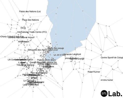
A tentative map of Foursquare “territories” in Geneva, using a Voronoï diagram produced with R (slightly skewed?) using the location of the most active places (more than 10 checkins not produced by the mayor).
Data interoperability:
The use of multiple technologies and programming languages forces the definition of XML Schemas to exchange data (when not using plain CSV files). Here I had to build my own schema as I am still looking for a proper schema for spatio-temporal data interoperability.
Data visualization:
This was the opportunity to get more familiar with the limits of the Flex graphics package, in comparison to what could have been done in Processing, particularly with the integration of a map. In this project, I was looking for an alternative to ModestMap (that I employ in other mapping projects) for a maximum freedom with different types of overlays. I toyed with the open source flex component HeatMap with time missing to produce a compelling solution. As a result, and for or simplicity reasons I ended up producing the Flickr heatmap with R.
Prototyping to surface problems
A part of the learning process is to understand the limits of a particular approach. As any user-generated content, the Foursquare dataset is particularly challenging because it contains inconsistencies that request manual data polishing, problematic when the solution must scale. The Foursquare API limit is another problem that can prevent from scaling-up from Geneva to another urban area with richer public activities. The workaround for this prototype was to solely analyze the 200 most active non-private “places”.
Prototyping to convey a message
A tangible and concrete example is a sure medium to communicate an investigation and its intentions. In this prototype, I want to first further emphasize the presence of spatial data from the use of social networks, that, when analyzed, can describe an city or a space. Second, these data have a temporal dimensions (historical for Flickr and immediate for Foursquare) as described by Adam Greenfield in The Long Here and the Big Now (see his talk at Lift). Third, beyond mapping data and the beauty of maps, I want to move the investigation to the development of quantifiable indicators that contribute to qualify a city, its spaces and its events (think of a form of Geodesign). The photogenic index that analyses the activity of photographers for an area and event is example in that direction. Finally, the imperfection of the results also highlight the limiting scope of the quantitative data analysis (see The “Quants”, their Normalizations and their Abstractions).
Prototyping to collect feedback
A prototype – even at an early stage – acts as an invitation to discuss opinions and criticize a concept. I apply an iterative process to fast prototyping that involves an increasing amount of pairs of eyes at each loop. The key is to make the object of development just good enough to understand and attract people, but never too polished in order to keep the options open. This iterative process with constant feedback helps each actor’s discourse to develop and helps frame further investigation. In this project, I received the first feedback on the graphic design of a spatio-temporal visualization that I serve for other projects.
Why do I blog this: I tried to provide answers the questions on the purpose of prototyping for Lift 10. Allocating time for fast prototyping is part of my research practice. It feed the development of other (more internal) projects that often involves more constraints and a limiting scope. I also recommend these rules to building prototypes written by Tristan Ferne.
Posted: May 5th, 2010 | 1 Comment »
These past days I have been working with my Lift Lab colleagues on a pet project for Lift 10 that aimed at providing an unusual map of Geneva. Here is the spiel as posted on the project page Geneva From its Social Network Activities:
The Lift Conference series has covered several themes on the digitization of the contemporary cities. In 2009, Dan Hill argued that the way citizens and visitors live and feel the urban environment is beginning to be profoundly affected by new information layers. Carlo Ratti showed us new ways of sense making of this deluge of information through data mining and visualizations techniques. For this year’s edition, Lift Lab wanted to participate with a tangible contribution that leverage the emergence of new urban information layers.
We have been capturing the activity generated around various social networks (Flickr, Foursquare) in Geneva from the data available via these services API. Through data analysis and visualization techniques, we produced an interactive map of the city, revealing photogenic areas (e.g. the waterfront) with public places (e.g. Bains des Pâquis, Parc des Bastion) and events (e.g. Geneva Motor Show, Geneva Festival) people like to share online. The result shows these dynamic information layers with their spatial and temporal trends as invitations to explore or rediscover Geneva.
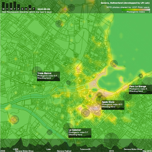
Snapshot of Geneva on May 4, 2010 (day before Lift10) revealing active places and their trends.
This kind of dynamic map exemplifies our recent investigations that leverage existing soft infrastructures (e.g. mobile phone networks, near-field communications, user-generated content) to create novel user experiences as well as refine the understanding of urban dynamics, mobility and occupancy levels. Over the years we have been engaged to produce techniques and prototypes for city governments (City of New York, Province of Florence), mobility service and infrastructure providers (Boeing, BitCarrier), mobile service providers (Orange R&D, Swisscom) and recently museum and exhibition managers (Le Louvre, Geneva Palexpo).
Why do I blog this: Besides prototyping something fun (and hopefully not frivolous), it was an opportunity to 1) refresh some of my pieces of code mixing R for data analysis, Java for data mining and back-end and AS3 for the front-end and 2) explore and experiment with new data manipulation techniques and R methods. Thanks to designer Maja Denzer for her informal advises at the beginning of the project. Here are the screenshots as testaments of the evolution of the interface.