Posted: February 23rd, 2011 | Comments Off

It is rewarding to see some our areas of investigation at Lift Lab burgeoning in relation with our clients and partners. For instance, we now have a good set of tools and reasonably well-documented processes that help qualify and profile territories from their network activity (e.g. GSM, WiFi, Bluetooth, mobility infrastructures, social networks). One specificity of our approach is to produce visualizations that characterize the data at hand very early in the analysis process. It tremendously helps bring the different actors of a project on the same page by opening a dialogue and their interpretations of what they see is often great material for early insights to focus the investigation (see Exploration and engage in the discussion in the Data City essay).
This ability to sketch with data is particularly fruitful when dealing with multidisciplinarity. Indeed, data visualization brings together over a same language very diverse practices and methodologies (e.g. in our projects on network data, we deal with a bestiary of physicists, network engineers, marketing directors, salesmen, architects, geographers, social scientists, innovation specialists, …). Over the last months, we have been very fortunate to partner with our friends at Bestiario who share a common vision : data visualization is part of an innovation process not its outcome. They applied this perspective in their latest product Impure, an engine with an intuitive visual programming language. Impure has particularly revolutionized our ability to quickly communicate the early results our investigation. In a few weeks we have been able to swiftly create interfaces in collaboration with designers that did not have prior programming skill. One outcome of the use of our set of tools is Elephant Path, a concept by Lift Lab, designed and implemented by the young designer Olivier Plante in Impure :
Elephant Path, a social navigation interface based on he thousand of pieces of information inhabitants and visitors share publicly on the web
Our idea of Elephant Path germinated years ago with the emergence of new ways of reading and discovering a territory through its digital activities (see my PhD thesis). It collided with our long interest in the principles of social navigation (see rss4you developed by Nicolas and Robi in the early days of content syndication) that leverage traces of activities with the goal to facilitate locating and evaluating information. In the physical world, a classic example of social navigation is a trail (called elephant path, desire line, social trail or desire path) developed by erosion caused by people making their own shortcuts (a phenomenon we like to observe).
Taking that concept into the informational layers of our cities and regions, we sketched in Impure the possibility to reveal unofficial routes and beaten tracks through the thousand of pieces of information inhabitants and visitors share publicly on the web. Technically, we deployed our own algorithms to extract travel sequences using collections of user-generated content from Wikipedia, Flickr and Geonames. For each region, Elephant Path lists Wikipedia entries and selects some of the monuments, parks, and other popular sites with a story. It consolidates the the Wikipedia entries with geographical coordinates via the Geonames API. Then, it uses the Flickr API to collect the information photographers share at these locations. Finally is applies our own network data analysis algorithms to filter the data, produce travel sequences and measure photogenic levels.
We have done it for both Paris and Barcelona. For each city, Elephant Path provides measures on the main trails, on the photogenic attractions and the months of activity. For instance the information reveals that:
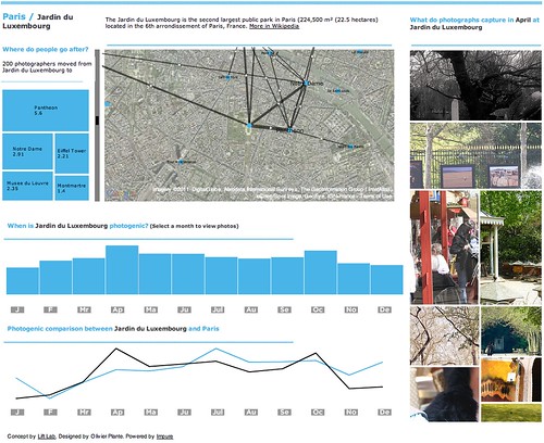
Paris seems to be a “summer” destination according to their monthly photographic activity. If you are in Paris during that period, the parks (Bois de Boulogne, Parc Monceau and Jardin du Luxembourg) might not be you visiting priorities. Indeed, these sites seem to be more photogenic in Spring and Fall. But if you are at Jardin du Luxembourg, there is some chances that you were in the St-Germain des Prés neighborhood (e.g. Café de Flore) previously and that your stroll there might very well bring you to Centre Pompidou that links the nearby Panthéon with the trendy Marais neighborhood. Barcelona seems to be more of “fall” destination according to the monthly photographic activity. Discover it yourself. [More screenshots]
An interface designed for you to copy and adapt it
But Elephant Path doesn’t end with data visualization, maps and graphs that can be embedded into web pages. It is meant to be open and be appropriated in unexpected ways. The Impure platform offers numerous data access, information processing and visualization capabilities. You can copy the code and data of Elephant Path and improve it in your workspace. Content of the work content is under the terms of a Creative Commons License. Do not hesitate in ripping and adapting it!
Posted: February 21st, 2011 | Comments Off
Early last year Manuel Lima kindly invited me to contribute to his book at Princeton Architectural Press on the topic of Network Visualization. The book VisualComplexity: Mapping Patterns of Information is not available for pre-order. However my essay did not make through the last editor’s pass. My role was provide an overview of the topic “data city”, its future implications and the role of visualization in this context. I tried to give a high-level reflection on the field evaluating its present and future while keeping the text accessible with tangible examples. It was written in January 2010, it is unedited, but you still might find some relevant elements:
City and information
A city has, by default, always been about information and its diffusion. Historically, fixed settlements permitted the development of newspapers and the possibility for the exchange of information. It will continue to do so in the near future given the volume of data modern cities generate and the emerging selection of algorithms and visualizations available to us to extract information.
The digitization of information
Indeed, we are noticing a digitization of the contemporary cities with technologies embedded into its streets and buildings and carried by people and vehicles. This evolution has appended an informational membrane over the urban fabrics that afford citizens new flexibility in conducting their daily activities. Simultaneously, this membrane reports on previously invisible dynamics of a city; providing new means to the multiple actors of the urban life to reshape the spaces, the policies, the flows, the services and the many different aspects that constitute a city. For instance, the aggregated view of mobile phone traffic reveals the “pulse” of a city, detecting anomalies such as traffic congestions in real-time. Similarly, the deployment of radio frequency identification (RFID) tags connects inanimate objects into an Internet of Things. Ben Cerveny, strategic and conceptual advisor to the design studio Stamen, coined this evolutions as ”things informalize” using the following terms: “the city itself is becoming part of the Internet with a world of data moved piece by piece and collided against a open source toolchain and methodology”.
Tools and platforms to reveal the data city
The data collisions described by Ben Cerveny produce multiple layers of urban information accessible to the actors of the city for their appropriation. Mixed with the emergence of accessible cartography (e.g. Open Sreet Maps), descriptive languages (e.g. KML), data visualization platforms (e.g. GeoCommons), and data processing techniques (e.g. Geocoding), today’s representation of cities do not only depict the cityscape, they reveal conditions in the city that were previously hidden in spreadsheets and databases. As the datasets become more complex and their model of representation richer, graphically representing the city has become less a matter of convention and more a matter of invention. Indeed, traditional cartography with primitive line drawing and static images now co-exist with flexible solutions that separate row data from the map, and promote exploration with multiple-scale interactivity and reactive environments. This evolution was particularly striking with the popularity of “mash-ups”, linking information to space and mapping newly accessible urban data on top of interactive imageries.
Trends
The popularity of “mash-ups” have determined larger initiatives (e.g. “open data” and “web of data”) to free urban data from their silos and promote the public appropriation. Practically, city and government data have been also moving onto the Web making accessible the locations of infrastructures, crime reports or pollution readings. In consequence, “data scientists”, developers and designers create palettes of city data-based visualizations and application, transforming data and their visualization into a public good. In parallel, other platforms such as Pachube have contributed to the bottom-up generation and upload of city data with visualization platforms such as GeoCommons or IBM’s Many Eyes to communicate and share views. This participation offers the opportunity to change cities urban strategies, with potential innovations creating news way to look at the process of citymaking.
Other ways to share the dynamics of the city have emerged in a less obvious but nevertheless indicative unfolding. For instance, of the past years, Idealista a Spanish online real estate ad platform had been accumulating massive amount of information on the cities housing market. It is only recently they have started to offer, almost in real-time, their analysis of the evolution of the real estate market back to the public, with and API for developers to appropriate the results. This strategy offers a city the kind of insights that previously only tedious administrative survey procedures were producing.
Similarly, as the information is not always well-formatted for the analysis and visualization inquires, some initiatives had to develop “web scrapping” techniques to extract valuable data from the public web sites of local institutions and services providers. For instance, for the Oakland Crimespotting, the developers at Stamen Design parsed the web site of the Oakland City Police to produce an effective interactive visualization of crime data showing residents where crime is occurring and what types of crimes are being reported.
The roles of visualization
Exploration and engage in the discussion
The work of Stamen proved that this type of “interventionist mapping” go beyond the expository. Indeed the use of interactive visualization allow exploration and question-making; broadening the urban policy conversation. In fact, aesthetics plays a fundamental role in engaging the discussion. It is not without a reason may visualization of urban informational layers are exhibited in Museums. Indeed, the application of aesthetics to data does not only try to make citizens aware of what is happening around them, but also figuring out the most elegant ways of making the unseen felt and gather feedback. As a researcher at MIT Senseable City lab, I experienced the fundamental utility of “beautiful” visualization as part of investigation process, to attract attention of cities stakeholders, stimulate the dialogue and stretch the imagination. For instance, very early on in the Tracing the Visitor’s Eye project, we produced visualizations to acquire first-hand feedback from journalists and inhabitants of the Province of Florence. They naturally contextualize our work to the local politics, wondering whether the our results could help move the David statue to more appropriate tourist areas or whether they could better understand the impact of the implementation of low-cost airline in a near-by airport. In contrast, they also helped highlighting the “imperfect mirror to reality” we were projecting, rightfully arguing that the models and data supporting the visualization reveal only a partial perspective on visitors dynamics.
Decision making – integration into existing practices
The critics of mash-ups and raw data visualization is the necessary first step to produce knowledge. It leads to investigation, further linking the data to improve the ways professionals and authorities understand and manage cities. Indeed, architects, transportation engineers, urban planners, policy makers, community groups rely on new types of representations as communication instrument as much as means to analyze urban dynamics. In fact, the application of visualizations that combine the emerging time-space data has proven vital; particularly because language through which designer, planners and decision makers communicate plans is mainly visual.
Responsive environments
Outside the realm of professionals, the flexibility of new data processing and visualization techniques facilitate their communication to the public through multiple mediums, from projection on building facades to the transformation of physical space. Indeed, the cityscape offers plenty of interfaces to display the state of city-scale services such as energy consumption (e.g. green smoke) or road traffic. When communicated in real-time, the information creates a responsive environment capturing city dynamics, supporting the decision-making and adapting to the changing needs of the public. MIT Senseable City Lab’s seminal project WikiCity exemplifies the implementation of this feedback loop mechanism. This urban demo proposed a visualization platform for the citizen of Rome to view on large screens the city’s dynamics in real-time (e.g. presence of crowd, location of buses, awareness of events). This platform enabled people, participating to the Notte Bianca event, to become prime actors themselves, appropriating dynamically the city and the event. Besides the importunity of this type of responsive environment to improve the experience of a city, it raises challenges to design the mechanisms by which these services are provisioned and understand for which activity that citizens utilize them for?
Conclusion
The modern city is built not just upon physical infrastructure, but also upon patterns and flows of information that are growing and evolving. We are only at beginning of the development of the tools and visualizations that allow us to see these complex patterns of information over huge spans of time and space, or in any local context in real-time.
Yet, this data city face major challenges. Particularly, the collection of data and their communication involves the collaboration of multiple actors in different languages at the crossroad of urbanism, information architecture, geography and human sciences. Indeed, it is evident that the understanding of a city goes beyond logging machine states and events. Therefore, the data scientist fascination of the massive amount of data cities produces in “real-time”, should not discard the other points of view necessary to understand the city, its environment and its people. In other words, data alone does not explain and their visualizations do not stand alone.
Why do I blog this: Thanks to Manuel for the invitation. Even though the text did not pass the final cut, it was a very healthy and fun exercise to try to write about my work and domains of investigation in accessible terms.