After 11 years, time has come to close this personal research blog. It started as an attempt to move my research notebook online to forge new connections and keep track of my thoughts. At the moment of completing my PhD, this blog had proven an indispensable element of my research method used to communicate my work through about 1400 posts and feedback from 400 comments. It became a research tool, part of general open science movement in which I not only regularly discussed the advances in my research domain but also shared its hesitations and failures. This transparency on the implications of my work and the ones of my peers helped me cultivate a professional persona. The informal network of researchers and professionals that belong to the readership of my blog represent an invaluable goodwill that is part of the outcome of my PhD thesis and after. They encouraged me to discuss my research work in continuation of conferences and also outside of the traditional academic venues.
How will the so-called beautiful game of global football be different in a world where sport itself, and the culture of the fans who love it, is altered by the rush of data, quantification, analytics and digital delivery? What might a high-stakes match of the near future be like when every move is measured, and every tactic forecast by silicon? What will the technologically savvy supporter and the lifelong fan alike experience differently when Big Data takes on the game?
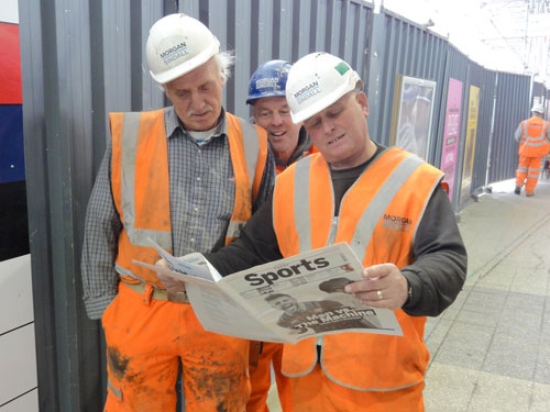
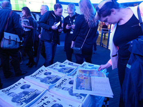
Launched at the National Football Museum in Manchester last week, our latest project, Winning Formula, explores these questions and some of the more unreal features of data-driven football future.
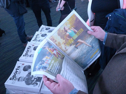
Winning Formula touches on more easily seen aspects of performance analytics, and new ways to depict and consume football in media, but also explores near-future possibilities hiding just below the surface, possible phenomena such as data manipulation as a kind of doping, the impacts of high-frequency sport betting, or politics related to data-based services like media, measurement and reporting. Commissioned by National Football Museum, Future Everything and CCCB, the result of our investigation takes the form of a newspaper sports section from April 2018. This hypothetical daily European tabloid called ‘Today’ is an exemplar of the way we use narrative and Design Fiction to create an engaging, thought-provoking perspective on a possible, plausible near future world that need not result in either a PowerPoint deck nor corporate white paper. The mundane form of a disposable daily newspaper, coming to you from April 2018 puts into the hands of everybody a possible day in the future when data, both large and small, alters some aspects of sports, from training to commentary, enhancements to prosthetics, rulings to viewing.
Some implications that the newspaper highlights are:
New measures of player and team performances
Data manipulation as a form of doping
High-frequency betting
Communication (sensors, images) hacking
Enhanced data services (TV and games)
New language to describe players and their roles
Tactics, micro-strategies and their readability
A resurgence of the local, artisanal, working-class lager
When parents learn from DNA their kid’s route to athletic excellence
The Molecular Football™ algorithm automatically produces snapshots of systems and micro-tactics such as: The Born Again Christmas Tree, The Spinal Trap, Perpetual Motion, or Zugzwang
In this project we mixed foresight techniques such as horizon scanning and scenario development to capture weak signals and posit disruptions in technology and society with a design approach to create fictional narratives of the future that focus on the implications behind the signals. We applied unusual approaches to interweaving everything from raw videogame datasets to rich description of artifacts and advertising from a hypothetical future to forecasts about politics, genomics, law, finance, technology, ethics, and climate change informed our design of both narrative and visuals contained within the quotidian vessel of the newspaper frame.
Credits Winning Formula is a Near Future Laboratory project commissioned and produced by FutureEverything, National Football Museum, Centre for Contemporary Culture Barcelona – CCCB, and Fundación Telefónica, supported by ECAS, a European Commission Culture Fund project and MEDIAPRO.
It is international, transdisciplinary effort that involved futurists, technologists, designers, and writers stretching from Europe, South America to the US, and is an example of a number of small practices and studios working in close collaboration. The project was conceived and directed by Fabien Girardin of Near Future Laboratory, and developed in tight collaboration with futurists Scott Smith of Changeist and Philippe Gargov of Seeklup. It was designed with Bestiario and includes the writing of Natalie Kane, Margot Baldassi, Christophe Kuchly and Valéry Mba Aboghe, and the translations of Eva Fernández García, Raphael Cosmidis with the help of Fanny Negre.
I have recently contributed to the April edition of Ethnography Matters on Ethnomining and the combination of qualitative & quantitative data. My story describes the overall process of our work with sensor data at the Louvre Museum in Paris. I particularly focus on the importance of mixed-methods when its comes to give full answers about behaviors and people usage of technology.
As the year ends, tradition calls for a review of the several initiatives I engaged in during 2012. The exercise entails looking back in time with the support social network activities and more personal logs (e.g. ical, emails) to keep track of gratifying rencontres and significant milestones at the Near Future Laboratory (see last year’s A Few Things the Laboratory did in 2011).
If this year had a mantra it would be: “sketching with data”, an approach to innovate with data I presented in various conferences and institutions from the high-tech cabarets such as Strata in San Francisco; or Red Innova in Madrid to the more cozy settings of the IAAC architecture school in Barcelona. These speaking engagements were part of a polishing phase that reports on the my evolving practice fed by the accumulated experiences on the ground. For instance, I discussed our investigation on the roles of a retail bank in the ‘smart’ city of the near future. Our client had fairly good ideas of the potentials of a real-time information platform. This is the kind of service a bank is extremely familiar with. However, they had limited knowledge on the specific information that could feed and emerge from this kind of platform. As part of our consulting work, we regularly sketched advanced dashboard for participants of the project to explore and interrogate their data with fresh perspectives. The use of the prototypes helped the client craft and tune indicators that qualify commercial activities. This experience still feeds the future bank services and products based on data.
Another gratifying outcome of the work around “sketching with data” was the release in June and November of the alpha and beta versions of Quadirgram (see Unveiling Quadrigram). The product resulted from a collaboration with my friends at Bestiario and responds to the increasing demand of clients to think (e.g. sketch) freely with data. The tool is meant to diffuse the power of information visualization within organizations and eventually reach the hands of people with knowledge and ideas of what data mean. I had the unique opportunity to influence many aspects of the product development and release process (engineering, user-experience, go to market strategy, client/investor/provider meetings) and now proudly sit in the advisory board of the company.
Other fruitful collaborations took place along the year, each of them bringing their unique set of experiences. I am particularly grateful to have joined forces with Urbanscale, Claro Partners, Interactive Things, Lift, Data Side and Pop-up Urbain. While a good share of the work stayed within confidential settings, I reserved efforts for self-started initiatives such as:
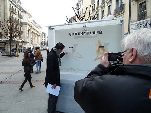
Ville Vivante: an ‘urban demo’ that took the form of a visual animation and eight posters deployed at the Geneva central station (project led by Lift Conference, in collaboration with Interactive Things).
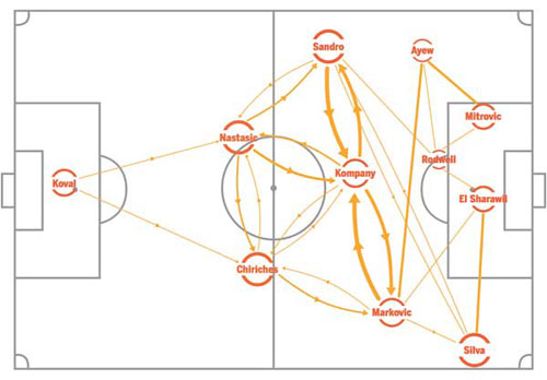
Footoscope: a deciphering tool for football amateurs developed in collaboration with Philippe Gargov of Pop-up Urbain. Its interface provides a perspective on the morphology and tactics of a football team according to raw data on its passing game transformed into indicators and visualizations.
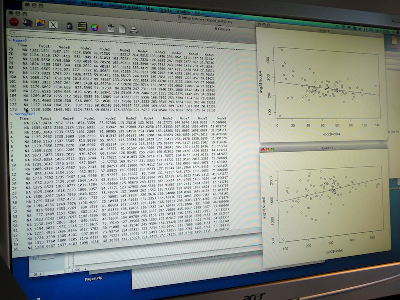
Finally, I kept some quiet moments to contribute to academia with reviews for Sensors, CHI, CSCW and Just-In-Time Sociology, teach a postgraduate course on the design of ‘data services’ and published of the paper New tools for studying visitor behaviors in museums: a case study at the Louvre co-authored with Yuji Yoshimura, UPF and MIT on a follow-up investigation of our hyper-congestion study at the Louvre.
Sports have always kept a tight relationship with data to measure performances. It has been particularly the case to improve athletes capabilities with motion analysis or objectify team sports that are easily fragmented into single events (e.g. Sabermetics). With new means of producing statistics through video and sensor technologies, other sports have started the search for objective knowledge. In the domain of football (i.e. soccer) companies such as Prozone and Opta Sports have led the innovation in data collection. In parallel, some academics have been exploring this new terrain to apply their statistics-led methodology (see A network theory analysis of football strategies). Similarly, designers have also started to transform these new measures (often in real-time) into sophisticated visualization to augment the spectator’s experience (see In-screen sports graphics).
At Near Future Laboratory, we regularly investigate the implications of the emerging presence of data particularly in the domain of the city and its services. Our work requires the joint understanding of space (e.g. a territory, its rules, cultures, history), of the networks that compose the space (both physical infrastructures and digital activities) and the human behaviors manifasted in that space. As part of our self-started initiatives, we enjoy employing these prisms to explore other intriguing domains such as football. In this ‘pet project’, we collaborated with the prospective consultant Philippe Gargov of [pop-up] urbain, connoisseur and writer on the use of statistics in football (see Passer aux stats supérieures) to augment his knowledge of football and tactics with prototyped visualizations that revealed the layout of teams through the average position of players, the key players in the passing game and the orientation each player gives to the game. We called this experiment Footoscope.
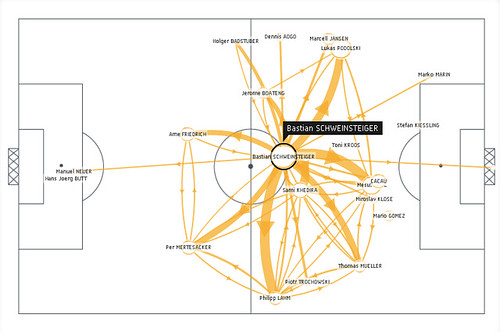
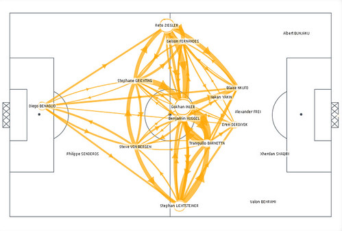
Footoscope provides a perspective on the morphology and tactics of a football team according to raw data on its passing game (e.g. passes between players, positions of the players when receiving the ball, playing time) transformed into indicators (e.g. “betweenness”) and visualizations (e.g. flows in the passing game, orientation of the propagation of the ball, layout of the team). We prototyped it with Quadrigram in order to share the tools with amateurs who want to become ‘footoscopists’ and decipher data on team they know or want to explore. We tested to tool with Philippe Gargov based on the raw statistics of the World Cup in South African accessible on the FIFA web site. Philippe did a great job in mixing his knowledge on the competition with the use of Footoscope. The results (in French) discuss, for instance, the key role of Bastian Schweinsteiger in Germany’s midfield that other players such as Stankovic or An Yong Ha failed to reproduce; or the incapacity for Switzerland to manage the distances between its lines. Read more (in French) on the Footoscope web site.
The key role of Bastian Schweinsteiger in Germany’s midfield, perfectly centered and well-connecter. More on Footoscope.
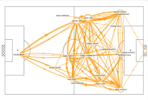
The incapacity for Switzerland to manage the distances between its lines, with its defense and strikers compacted at a short distance. This contrasts with a more balance team that takes a greater advantage of spaces such as Chile below. More on Footoscope.
Why do I blog this: Our pet projects are meant to explore new domains and ideas. Like other domains (e.g. cities, organizations) the analysis of football request the understanding of space, networks (data) and behaviors (observations). The collaboration with Philippe Gargov revealed some early insights on generating the dialogue between statistics and amateur knowledge of the terrain to produce a new apprehension of the game.
Recently the independent culture research lab ZZZINC interviewed me for the Mosaic online magazine. It was a pleasure to answer Paco González‘ questions on our practice at Near Future Laboratory and our work on urban data. The result is now online: Entrevista a Fabien Girardin (English version).
So for the last 8 months I have been working almost exclusively with my friends at the information visualization consulting company Bestiario on new tools to visualize information. Last year, based on our joint experience, we detected two increasing demands within innovative institutions. First the wish to think with liberty with data, outside of coding, scripting, wizard-based or blackbox solutions. Then, we perceived the necessity to diffuse the power of information visualization within organizations to reach the hands of people with knowledge and ideas of what data mean.
Our efforts have now culminated into Quadrigram, a Visual Programming Environment to gather, shape and share living data. By living data we mean data that are constantly changing and accumulating. They can come from social network, sensor feeds, human activity, surveys, or any kind of operation that produce digital information.
For Bestiario and its long track record in ‘haute couture’ interactive visualizations, Quadrigram offers ‘prêt-à-porter’ solutions for organizations, consultants, analysts, designers and programmers working routinely with these types of data. As with other services, data visualization plays a central role in the making sense and sharing of complex data.
I got the chance to work on multiple conceptual, engineering and strategic aspects of Quadrigram. In this post I summarize four most main areas I had the pleasure to shape in collaboration with Bestiario:
1) Redefining work with data
For us at Near Future Laboratory it made sense in helping Bestiario with our experience in prototyping solutions that become feedback loops where our clients can actually figure something out. Indeed, more and more results of our investigations became interfaces or objects with a means of input and control rather than only static reports. The design of Quadrigram lays on this very idea of ‘feedback loop’ and provides a WYSIWYG (What you see is what you get) interface. It is designed for iterative exploration and explanation. Each iterations or “sketches” is an opportunity to find new questions and provide answers with data. Data mutate, take different structure in order to unveil their multiple perspectives. We like to think that Quadrigram offers this unique ability to manipulate data as a living material that can be shaped in real time or as Mike Kuniavsky nicely describes in Smart Things: Ubiquitous Computing User Experience Design: “Information is an agile material that needs a medium”. And this not only concerns ‘data scientists’ but rather everybody with knowledge and ideas in a work that involves data.
With the diffusion of access to data (e.g. the open data movement), our investigation with data has become utterly multi-disciplinary. Nowadays, our projects embark different stakeholders with fast prototyped tools that promote the processing, recompilation, interpretation, and reinterpretation of insights. For instance, our experience shows that the multiple perspectives extracted from the use of exploratory data visualizations is crucial to quickly answer some basic questions and provoke many better ones. Moreover, the ability to quickly sketch an interactive system or dashboard is a way to develop a common language amongst varied and different stakeholders. It allows them to focus on tangible opportunities of product or service that are hidden within their data. I like to call this practice ‘Sketching with Data‘, others such as Matt Biddulph talks about “Prototyping with data” (see also Prototyping location apps with real data). Regardless of the verb used, we suggest a novel approach to work data in which analysis and visualizations are not the unique results, but rather the supporting elements of a co-creation process to extract value from data. In Quadrigram, the tools to sketch and prototype took the form of a Visual Programming Environment.
The teaser video summarize the vision behind Quadrigram
2) Reducing the barriers of data manipulation
Visual Programming Environments have flourished in the domain of information technologies, starting with LabVIEW in the 80s and then spreading to the emerging fields mixing data with creativity such as architecture, motion graphic and music. In these domains, they have demonstrated virtues in reducing the barrier of entry for non-experts (check the VL/HCC community for more on the topic). In the Visual Programming Environment we developed, users manipulate in an interactive way pre-programmed modules represented as graphical elements. When connected, these modules form a ‘data flow’ (also called dataflow programming) that provide a constant visual awareness the result of the program (“What You See Is What You Get”) ideal for quick “trial and error” explorations. This way the tool allows for the evaluation of multiple pathways towards the correct solution or desired result. It inspires solution-finding for non-technical professional by exposing the full flow of data.
The take a tour video presents the Visual Programming Environment that offers a transparent way of setting up a solution, that contrast with wizard-based environments and their “black boxes”.
3) Creating a coherent language
A major challenge when grouping tools to work with data within a common Visual Programming Environments has been to define basic building blocks of a language. Starting from scratch, we used an exploratory phase that led to the release of an experimental environment called Impure and its large sets (500) of diverse modules. This free solution generated a decent community of valorous 5000 users. We used Impure as testbed for our ideas and perform the necessary user studies to come up with a coherent basic language. We particularly focused on specific action verbs (what people can do see Verbs and design and verbs) that enclose the most common operations on data: sort, search, insert, merge, count, compare, replace, remove, filter, create, get, cluster, encode, decode, convert, accumulate, split, resize, set, execute, load, save. These actions are performed on Data Structures (e.g. create List, sort Table, replace String, cluster Network, compare Date, resize Rectangle, load Image, …) within specific domains (e.g. Math, Geography, Statistics, …). The language is complemented with a growing list of Visualizers categorized according to their objectives to reveal aspects about the data (e.g. compare, contextualize, relate, …). Through this structure (actions – structure – domain) user can find the appropriate module within a very dense and diverse toolset.
This exploratory analysis video shows how a unique language provides similar perspectives in the same dataset.
4) Steering the development of an environment that takes advantage of an ecosystem of great tools
Bestiario’s CEO José Aguirre always like to present Quadrigram as a sponge capable of absorbing information from many diverse sources: social networks, data bases, Internet of Things, social media tools, business analytics tools, etc. stressing that “In the wild we know that it is not the strongest who survive but rather those who best cooperate”. We brought that vision to reality with an environment based on severs ‘in the cloud’ that integrates with other sophisticated tools. Like many other platforms, Quadrigram connects to various types of data sources (databases, APIs, files, …) to load data within a workspace. But we also wanted users with detailed needs to take advantage R scripting to perform advanced statistical method or Gephi to layout large networks. The main challenge was to find and implement a protocol to communicate Quadgrigram data structure back and forth with these great tools. In other words, we wanted users to perform analysis in R as part of their data flow. Similar to the architecture of distributed systems and the used of JSON nowadays, the solution was to pass around serialized Quadrigram objects. That offers a pretty unique mechanism to store and share results of data manipulations, what we call “memories”. For instance the content of a Table stored in Quadrigram server is available publically to other tools via a URL (e.g. http://nfl.quadrigram.com/account/m/ext/memo/public/fabien/cosm/cpu store an analysis of my CPU activity)
Why do I blog this: It has been a unique opportunity to help shape a software product and bring it to market. When we created Lift Lab and now Near Future Laboratory we knew if was the kind of experience we wanted to live. This post is an attempt to keep track of the work performed to make Quadrigram a tool that we hope will open new practices around the manipulation and visualization of data. Thanks to the team at Bestiario for their talent and stimulating discussions. I will continue contributing to the project with constant technical, strategic and conceptual guidance. I have also jumped in the advisory board in company of Bernando Hernandez and Jaume Oliu.
Over the last year we have been collaborating with the mobile phone operator Swisscom and the City of Geneva to materialize insights on urban centralities and the connectivity of central neighborhoods with peripheral towns. The fundamentals of this project rely on measures, maps and visualizations of the pulse of the city through the activity of its mobile phone networks.
In the desire to make this work more public and raise the public awareness on the use of network data as part of urban management strategies, the Mayor of Geneva proposed to embed the data into were they are generated. To produce this ‘urban demo’ we collaborated with our friends at the Lift Conference to create an event and delivered aggregated network activity measures to the digital magicians at Interactive Things. Their evocative visualizations named Ville Vivante took the form of a visual animation and eight posters deployed at the Geneva central station from February 20th to March 4th 2012.
The visual animation
The posters present in key areas of the train station
And Interactive Things co-founder Benjamin Wiederkehr presenting the project and their magic at the Lift Conference
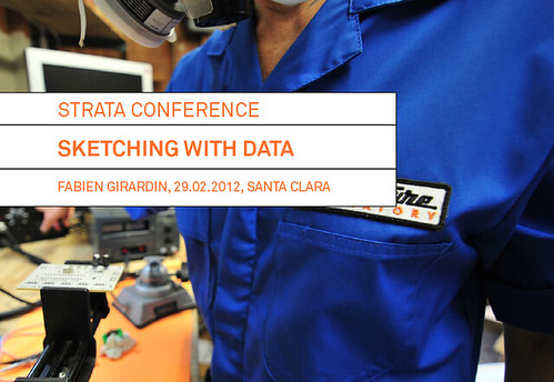
Last week I participated to the O’Reilly Strata Conference with a 40-minutes talk in the session on ‘visualization & interfaces’. My contribution suggested the necessity to quickly answer and produce questions at different stages of the innovation process with data. I extended the material presented at Smart City World Congress by adding some narrative on the practice of sketching by major world changers and focussing on Quadrigram as an example of tools that embraces this practice with data. The abstract went as follow:
Sketching with data
Since the early days of the data deluge, the Near Future Laboratory has been helping many actors of the ‘smart city’ in transforming the accumulation of network data (e.g. cellular network activity, aggregated credit card transactions, real-time traffic information, user-generated content) into products or services. Due to their innovative and transversal incline, our projects generally involve a wide variety of professionals from physicist and engineers to lawyers, decision makers and strategists.
Our innovation methods embark these different stakeholders with fast prototyped tools that promote the processing, recompilation, interpretation, and reinterpretation of insights. For instance, our experience shows that the multiple perspectives extracted from the use of exploratory data visualizations is crucial to quickly answer some basic questions and provoke many better ones. Moreover, the ability to quickly sketch an interactive system or dashboard is a way to develop a common language amongst varied and different stakeholders. It allows them to focus on tangible opportunities of product or service that are hidden within their data. In this form of rapid visual business intelligence, an analysis and its visualization are not the results, but rather the supporting elements of a co-creation process to extract value from data.
We will exemplify our methods with tools that help engage a wide spectrum of professionals to the innovation path in data science. These tools are based on a flexible data platform and visual programming environment that permit to go beyond the limited design possibilities industry standards. Additionally they reduce the prototyping time necessary to sketch interactive visualizations that allow the different stakeholder of an organization to take an active part in the design of services or products.
My name is Fabien Girardin. I used this blog between March 2003 and March 2014 to report on my readings, thoughts and milestones as part of my research, particularly in the domains of mobility, urban environments, and infrastructure-human interaction