Posted: December 4th, 2011 | Comments Off
This week was dedicated to the Smart City World Congress in Barcelona. It was my first outing in a comfy Near Future Laboratory jumpsuit. With Nicolas, we are indeed slowly shutting down the mainframes at Lift Lab and relocating our immaterialities to the Near Future Laboratory facilities. These things take their good share of time and energy, but we are pretty excited to merging our operations with a new gang of scouts dispersed hither and yon. The event collided with two other important milestones of projects steered these past few months.
First our client BBVA, presented publicly some of the measures and indicators of commercial activities in cities we have been producing and investigating. The visual supports of this project take the forms of maps (pdf), dashboards, and tools that each reveal a city and its quantified streets under new spatio-temporal lights.
Second, my peeps at Bestiario have working endlessly to release Quadrigram, a tool for individuals and organizations that work intensively with data and information. We are now running in private beta. More on that later.
Captured preaching the word and proudly exposing a near future laboratory jumpsuit
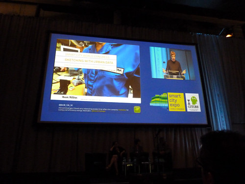
So, in the margin of the multiple discussions on the definitions of a *smart* city, I could not help but contribute to the congress with my experience on the field in making urban data work. My discoursed focused on the necessity to treat data as a living material that must be crafted and manipulated at the different stages of knowledge and service production. I name that “sketching with data” and as with any creative work with digital technologies, it comes with tools and an undisciplinary process. Here are the slide deck + notes of my talk:
Sketching with urban data (PDF 6.9MB) presented at the Smart City World Congress in Barcelona on 29.11.2011.
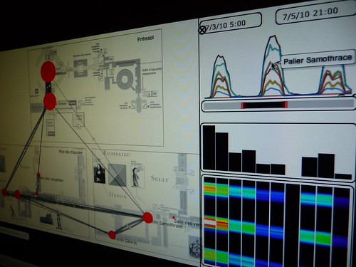
In the audience, Alexandra Etel Rodriguez, Partner at Connected Brains produced visual notes of my talk. Thanks Alexandra for sharing this graphic recording!

Thanks to the organizers for the invitation!
Posted: October 11th, 2011 | Comments Off
There is this influential dispatch “Follow Curiosity, Not Careers” by Julian Bleecker that I love to refer to. In a few paragraphs he argues for the importance of shifting ones practices and area of activity of 3-5 years cycles. Cycles that are driven by curiosity with phases that link sometimes consciously and sometimes in unplanned and disruptive manners.
Two years ago, I engaged into a Making/Creating/Building phase after the feeling that my “voice” of my academic journey needed a renewal. At that time, I was shaping a project for the Louvre on the evolution of “hyper-congestion” levels in key areas of the museum. An investigation directed at the urban informatics era when few people had experience of actually working with local authorities or decision makers on a large scale that affect either governance or built fabric (reminding me of Dan Hill indication of shortcoming of the Microsoft Research Social Computing Symposium 2010).
At the Louvre experimenting with sensors to measure levels of hyper-congestion.
Since then, I have persisted working on the ground, observing clients and partners practices, responding to opportunities and glitches with new data tools and experimenting with research methods. I was particularly focused in understanding how the exploitation of network data could integrate and complement traditional processes. It means confronting my evolving practice, plotting in unknown territories, or tinkering the business and financial aspects of a product “go to market” strategy. The phase has been extremely enriching that I only start to grasp coherently. Along the path, I got to lead the making/creation/building for the multiple actors of the ‘smart city’:
- A geographical information provider: a GIS model that generate a novel type of street data based on social media content for cities with very limited information layers.
- A real-time traffic information provider: innovative indicators and interactive visualizations that profile the traffic on key road segments.
- A multinational retail bank: co-create its role in the networked city of the near future with a mix of workshops and tangible results on how bank data are sources of novel services.
- A large exhibition and convention center: with audits based on sensor data to rethink the way they can manage and sells their spaces.
- A mobile phone operator and a city council: to measure the pulse at different parts of the city from its cellphone network activity and extract value for both city governance and new services for citizens and mobile customers.
- It has been equally important to independently explore the ideas shared at Lift Lab either through academic collaborations with UPF, MIT, EPFL or through the actual experimentation of services like elephant-path.com that I would love to develop more.
Today, my trousers are scuffed. This accumulated experience on the field requests a move to a next phase to what Julian would describe as:
And subsequent years, refining and polishing that “voice”. Keep moving, refining, finding ways to continue to learn and bringing all the other bits of learning, the other “fields”, the other ways of knowing and seeing the world, all the other bounded disciplines — let them intrude and change things.
Practically, I will continue to push Lift Lab in imagining fast-prototyping ‘stuff’ and explore their implications as a core element our investigation. But the most exciting feeling is that I can start polishing a “voice” in company of a growing list of friends I admire who now run their own boutiques/studios/collective/structure to operate on the field and practically contribute in shaping the urban near future. They are the Bestiario, Urbanscale, City Innovation Group, Everythng. We share an approach that dramatically contrast with the data-driven ‘smart city’ marketing ploy. We come from practices that integrate the importance of learning from both history and fiction, that understand the implication from the long-running theoretical and practical challenges of using data to improve urban life. We are aware of the shortcoming of data models (see The “Quants”, their Normalizations and their Abstractions), we experimented the value of Mixed Methods and are becoming fluent in both design and research approaches as sources of knowledge as so elegantly described by Kevin Walker Design Research and Research Design.
The shift of phase comes naturally with attempts of finding coherence in the contributions of the last two years or simply “polishing my practice”. So practically: I have been exploring the exploitation of network data (byproducts of digital activity) as material to qualify the built environment and produce new insights for the different actors of the urban space (e.g. city governments, service providers, citizens). These stakeholders have approached Lift Lab to a) find unknown benefits in data they already exploit or b) investigate specific problems they instinctively feel network data will help them solve.
There is one specific methodological aspect to emerge from my work. A year ago, I described it as “Sketching with data“. I found it extremely useful to go beyond the traditional ways of sharing the exploration of network data and avoid the contemporary experience with data as described in the recent review of the IBM’s “Think” exhibition in New York.
“But we get no practical sense of how traffic information might be useful.”
[…]
“It would have been far more powerful to have an interactive display that led viewers on a path of interpretation and mapping, so we could experience the process instead of simply sampling images. “
The exhibition is actually quite insightful and I value the effort of IBM to communicate. However in projects involving multiple stakeholders, the ability to rapidly sharing interactive information visualizations is a key practice to transform information into a tangible and imperfect material. Recently I attempted to describe it in an abstract submitted to a practitioners’ conference sub:
Since the early days of the data deluge, Lift Lab has been helping many actors of the ‘smart city’ in transforming the accumulation of network data (e.g. cellular network activity, aggregated credit card transactions, real-time traffic information, user-generated content) into products or services. Due to their innovative and transversal incline, our projects generally involve a wide variety of professionals from physicist and engineers to lawyers, decision makers and strategists. Our innovation methods embark these different stakeholders with fast prototyped tools that promote the processing, recompilation, interpretation, and reinterpretation of insights. For instance, our experience shows that the multiple perspectives extracted from the use of exploratory data visualizations is crucial to quickly answer some basic questions and provoke many better ones. Moreover, the ability to quickly sketch an interactive system or dashboard is a way to develop a common language amongst varied and different stakeholders. It allows them to focus on tangible opportunities of product or service that are hidden within their data. In this form of rapid visual business intelligence, an analysis and its visualization are not the results, but rather the supporting elements of a co-creation process to extract value from data. We will exemplify our methods with tools that help engage a wide spectrum of professionals to the innovation path in data science. These tools are based on a flexible data platform and visual programming environment that permit to go beyond the limited design possibilities industry standards. Additionally they reduce the prototyping time necessary to sketch interactive visualizations that allow the different stakeholder of an organization to take an active part in the design of services or products.
Sketching with mobility data in Impure
Why do I blog this: The idea of shifting ones practice and area of activity is quite important to me. It comes with phases similar to the pursue of a PhD (listen, propose, experiment, contribute with a voice, confront the contributions). The shift of phase is sometimes planned and sometimes affected by external event. This polishing phase occurs with pleasant evolutions the name, structures and focus of Lift Lab. More on that later…
Posted: May 31st, 2011 | Comments Off
The other day I took part of a round table on entrepreneurship for investigators organized by Universitat Pompeu Fabra to promote their latest incubator in collaboration with Barcelona Activa. Since I finished my PhD and co-founded Lift Lab one and a half year ago, young researchers have frequently inquired on my personal experience to move from academia to a private research agency. I often explain how we modeled our research methods and analysis techniques to fit into processes. Or I point our techniques to transform results into insights and solutions for diverse audiences (engineering, design, marketing, management). Beyond the evolution of our practice, there are a couple of ingredients that I believe greatly help initiating the trajectory of a business that spins out of an extended investigation (the PhDs of Nicolas and I in the case of Lift Lab):
Nurture a mixed network…
Lift Lab was already taking shape during our research as part of our constant efforts to communicate our ideas and results, using our blogs, pamphlets, talks and workshops as echo chambers. It was particularly important for us to confront our findings outside of a single research community as much as outside of academia. Reaching out of the walled gardens of academia, listening and reading about other practices is particularly important to refine and polish a voice, the kind of voice that makes research finding more tangible and accessible in a life after academia. In our case, it helped us capture the interest of what-would-then-become clients and create diverse channels of communication with people that challenged our intuitions, confront our points of view and ultimately made our methods evolve. Prior to move out of academia, these contacts were already grasping the value we could produce in their contact. Ultimately, these channels exposed, nurtured and also generated some sense of legitimacy that we use to further inspire and provoke.
… to benefit from a community …
As a consequence, our business thrives on this ability to involve multiple practices and networks for question formulations, data collection and solution creation. Our links to academic institutions (e.g. following master or PhD students) provide unique opportunities to further polish our research methods and well as new techniques and latest findings. With our experience in academia, it comes at very little cost and it is very rewarding. In parallel, we like to expend our network based on our curiosity with partners, “extreme users” and anybody we can learn from. The Lift community reflects very well this access to different practices, the confrontation of ideas/methods/interests and the access to domains and problems we never suspected we could be engaged int. When mobilized, this type of network provides resources for a small agency like ours to extend the range of our services and share risks in a bid.
… that helps (among other things) correct the execution …
A few concepts spun out of our PhDs, but none of them were ready to even remotely consider a product or service. Nevertheless, we like to engage with our clients to test the maturing concepts (e.g. social navigation). It helps refining the ideas, evaluate them with users and our network. Through this iterations, clients and partners might invest in the idea and engage resources. In any case, the exercise delivers keys that shape the execution of a concept that is very often more important than the idea itself. Once again the capacity to transfer results and intuitions into innovative prototypes is deeply rooted in our ecosystem of friends and partners.
… and forces to stay humble but assertive.
We found out that leaving academia improved our ability to formulate our methods particularly thanks to the diversity of constraints that demand a diversity of techniques. However, we make efforts in keeping the ideological approach of a researcher intact. It implies staying humble, not starting an investigation with a priori assumptions and not being afraid to express dots. When conveyed with assertiveness, this posture of the researcher driven by doubts but confident in its methods is what makes our value.

Why do I blog this: The paths out of academia are not paved, particularly because completing a PhD today differs from 15 years ago. Researchers must adapt to the increasing speed of knowledge sharing without necessarily grasping the opportunities to cross-pollinate. Beyond incubators, the mixed networks I describe here represent a support that helps concepts and a business mature.
Posted: May 30th, 2011 | Comments Off
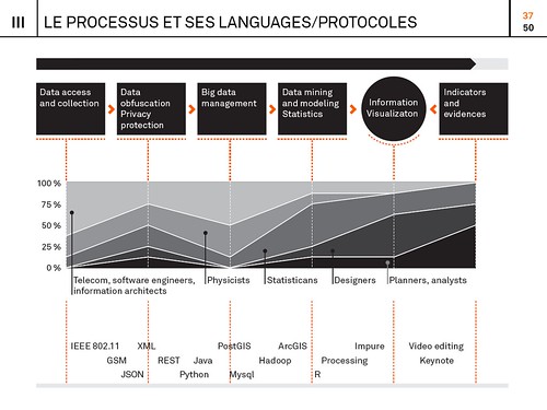
Below are the slides of a lectures I gave a couple of weeks ago at the ENSCI (Ecole nationale supérieure de création industrielle) in Paris. The content (in French) is mainly directed to design students and practitioners intrigued about the new digital urban actors and the process to materialize layers of network data into information. I based my discourse on the recent investigations and experimentations we perform at Lift Lab (e.g. study of hyper-congestion, mobility, social navigation). Particularly, I highlighted the bestiary of practices, tools, languages and protocols that we articulate our approach with:
Un nouveau monde de données, ENSCI, May 18, 2001 (15.8MB)
The ENSCI offers a particularly compelling approach to its student by confronting them with concepts and practices at the frontiers of design. Thanks to David Bihanic and Licia Bottura for the invitation!
Posted: February 23rd, 2011 | Comments Off

It is rewarding to see some our areas of investigation at Lift Lab burgeoning in relation with our clients and partners. For instance, we now have a good set of tools and reasonably well-documented processes that help qualify and profile territories from their network activity (e.g. GSM, WiFi, Bluetooth, mobility infrastructures, social networks). One specificity of our approach is to produce visualizations that characterize the data at hand very early in the analysis process. It tremendously helps bring the different actors of a project on the same page by opening a dialogue and their interpretations of what they see is often great material for early insights to focus the investigation (see Exploration and engage in the discussion in the Data City essay).
This ability to sketch with data is particularly fruitful when dealing with multidisciplinarity. Indeed, data visualization brings together over a same language very diverse practices and methodologies (e.g. in our projects on network data, we deal with a bestiary of physicists, network engineers, marketing directors, salesmen, architects, geographers, social scientists, innovation specialists, …). Over the last months, we have been very fortunate to partner with our friends at Bestiario who share a common vision : data visualization is part of an innovation process not its outcome. They applied this perspective in their latest product Impure, an engine with an intuitive visual programming language. Impure has particularly revolutionized our ability to quickly communicate the early results our investigation. In a few weeks we have been able to swiftly create interfaces in collaboration with designers that did not have prior programming skill. One outcome of the use of our set of tools is Elephant Path, a concept by Lift Lab, designed and implemented by the young designer Olivier Plante in Impure :
Elephant Path, a social navigation interface based on he thousand of pieces of information inhabitants and visitors share publicly on the web
Our idea of Elephant Path germinated years ago with the emergence of new ways of reading and discovering a territory through its digital activities (see my PhD thesis). It collided with our long interest in the principles of social navigation (see rss4you developed by Nicolas and Robi in the early days of content syndication) that leverage traces of activities with the goal to facilitate locating and evaluating information. In the physical world, a classic example of social navigation is a trail (called elephant path, desire line, social trail or desire path) developed by erosion caused by people making their own shortcuts (a phenomenon we like to observe).
Taking that concept into the informational layers of our cities and regions, we sketched in Impure the possibility to reveal unofficial routes and beaten tracks through the thousand of pieces of information inhabitants and visitors share publicly on the web. Technically, we deployed our own algorithms to extract travel sequences using collections of user-generated content from Wikipedia, Flickr and Geonames. For each region, Elephant Path lists Wikipedia entries and selects some of the monuments, parks, and other popular sites with a story. It consolidates the the Wikipedia entries with geographical coordinates via the Geonames API. Then, it uses the Flickr API to collect the information photographers share at these locations. Finally is applies our own network data analysis algorithms to filter the data, produce travel sequences and measure photogenic levels.
We have done it for both Paris and Barcelona. For each city, Elephant Path provides measures on the main trails, on the photogenic attractions and the months of activity. For instance the information reveals that:
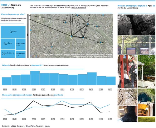
Paris seems to be a “summer” destination according to their monthly photographic activity. If you are in Paris during that period, the parks (Bois de Boulogne, Parc Monceau and Jardin du Luxembourg) might not be you visiting priorities. Indeed, these sites seem to be more photogenic in Spring and Fall. But if you are at Jardin du Luxembourg, there is some chances that you were in the St-Germain des Prés neighborhood (e.g. Café de Flore) previously and that your stroll there might very well bring you to Centre Pompidou that links the nearby Panthéon with the trendy Marais neighborhood. Barcelona seems to be more of “fall” destination according to the monthly photographic activity. Discover it yourself. [More screenshots]
An interface designed for you to copy and adapt it
But Elephant Path doesn’t end with data visualization, maps and graphs that can be embedded into web pages. It is meant to be open and be appropriated in unexpected ways. The Impure platform offers numerous data access, information processing and visualization capabilities. You can copy the code and data of Elephant Path and improve it in your workspace. Content of the work content is under the terms of a Creative Commons License. Do not hesitate in ripping and adapting it!
Posted: February 21st, 2011 | Comments Off
Early last year Manuel Lima kindly invited me to contribute to his book at Princeton Architectural Press on the topic of Network Visualization. The book VisualComplexity: Mapping Patterns of Information is not available for pre-order. However my essay did not make through the last editor’s pass. My role was provide an overview of the topic “data city”, its future implications and the role of visualization in this context. I tried to give a high-level reflection on the field evaluating its present and future while keeping the text accessible with tangible examples. It was written in January 2010, it is unedited, but you still might find some relevant elements:
City and information
A city has, by default, always been about information and its diffusion. Historically, fixed settlements permitted the development of newspapers and the possibility for the exchange of information. It will continue to do so in the near future given the volume of data modern cities generate and the emerging selection of algorithms and visualizations available to us to extract information.
The digitization of information
Indeed, we are noticing a digitization of the contemporary cities with technologies embedded into its streets and buildings and carried by people and vehicles. This evolution has appended an informational membrane over the urban fabrics that afford citizens new flexibility in conducting their daily activities. Simultaneously, this membrane reports on previously invisible dynamics of a city; providing new means to the multiple actors of the urban life to reshape the spaces, the policies, the flows, the services and the many different aspects that constitute a city. For instance, the aggregated view of mobile phone traffic reveals the “pulse” of a city, detecting anomalies such as traffic congestions in real-time. Similarly, the deployment of radio frequency identification (RFID) tags connects inanimate objects into an Internet of Things. Ben Cerveny, strategic and conceptual advisor to the design studio Stamen, coined this evolutions as ”things informalize” using the following terms: “the city itself is becoming part of the Internet with a world of data moved piece by piece and collided against a open source toolchain and methodology”.
Tools and platforms to reveal the data city
The data collisions described by Ben Cerveny produce multiple layers of urban information accessible to the actors of the city for their appropriation. Mixed with the emergence of accessible cartography (e.g. Open Sreet Maps), descriptive languages (e.g. KML), data visualization platforms (e.g. GeoCommons), and data processing techniques (e.g. Geocoding), today’s representation of cities do not only depict the cityscape, they reveal conditions in the city that were previously hidden in spreadsheets and databases. As the datasets become more complex and their model of representation richer, graphically representing the city has become less a matter of convention and more a matter of invention. Indeed, traditional cartography with primitive line drawing and static images now co-exist with flexible solutions that separate row data from the map, and promote exploration with multiple-scale interactivity and reactive environments. This evolution was particularly striking with the popularity of “mash-ups”, linking information to space and mapping newly accessible urban data on top of interactive imageries.
Trends
The popularity of “mash-ups” have determined larger initiatives (e.g. “open data” and “web of data”) to free urban data from their silos and promote the public appropriation. Practically, city and government data have been also moving onto the Web making accessible the locations of infrastructures, crime reports or pollution readings. In consequence, “data scientists”, developers and designers create palettes of city data-based visualizations and application, transforming data and their visualization into a public good. In parallel, other platforms such as Pachube have contributed to the bottom-up generation and upload of city data with visualization platforms such as GeoCommons or IBM’s Many Eyes to communicate and share views. This participation offers the opportunity to change cities urban strategies, with potential innovations creating news way to look at the process of citymaking.
Other ways to share the dynamics of the city have emerged in a less obvious but nevertheless indicative unfolding. For instance, of the past years, Idealista a Spanish online real estate ad platform had been accumulating massive amount of information on the cities housing market. It is only recently they have started to offer, almost in real-time, their analysis of the evolution of the real estate market back to the public, with and API for developers to appropriate the results. This strategy offers a city the kind of insights that previously only tedious administrative survey procedures were producing.
Similarly, as the information is not always well-formatted for the analysis and visualization inquires, some initiatives had to develop “web scrapping” techniques to extract valuable data from the public web sites of local institutions and services providers. For instance, for the Oakland Crimespotting, the developers at Stamen Design parsed the web site of the Oakland City Police to produce an effective interactive visualization of crime data showing residents where crime is occurring and what types of crimes are being reported.
The roles of visualization
Exploration and engage in the discussion
The work of Stamen proved that this type of “interventionist mapping” go beyond the expository. Indeed the use of interactive visualization allow exploration and question-making; broadening the urban policy conversation. In fact, aesthetics plays a fundamental role in engaging the discussion. It is not without a reason may visualization of urban informational layers are exhibited in Museums. Indeed, the application of aesthetics to data does not only try to make citizens aware of what is happening around them, but also figuring out the most elegant ways of making the unseen felt and gather feedback. As a researcher at MIT Senseable City lab, I experienced the fundamental utility of “beautiful” visualization as part of investigation process, to attract attention of cities stakeholders, stimulate the dialogue and stretch the imagination. For instance, very early on in the Tracing the Visitor’s Eye project, we produced visualizations to acquire first-hand feedback from journalists and inhabitants of the Province of Florence. They naturally contextualize our work to the local politics, wondering whether the our results could help move the David statue to more appropriate tourist areas or whether they could better understand the impact of the implementation of low-cost airline in a near-by airport. In contrast, they also helped highlighting the “imperfect mirror to reality” we were projecting, rightfully arguing that the models and data supporting the visualization reveal only a partial perspective on visitors dynamics.
Decision making – integration into existing practices
The critics of mash-ups and raw data visualization is the necessary first step to produce knowledge. It leads to investigation, further linking the data to improve the ways professionals and authorities understand and manage cities. Indeed, architects, transportation engineers, urban planners, policy makers, community groups rely on new types of representations as communication instrument as much as means to analyze urban dynamics. In fact, the application of visualizations that combine the emerging time-space data has proven vital; particularly because language through which designer, planners and decision makers communicate plans is mainly visual.
Responsive environments
Outside the realm of professionals, the flexibility of new data processing and visualization techniques facilitate their communication to the public through multiple mediums, from projection on building facades to the transformation of physical space. Indeed, the cityscape offers plenty of interfaces to display the state of city-scale services such as energy consumption (e.g. green smoke) or road traffic. When communicated in real-time, the information creates a responsive environment capturing city dynamics, supporting the decision-making and adapting to the changing needs of the public. MIT Senseable City Lab’s seminal project WikiCity exemplifies the implementation of this feedback loop mechanism. This urban demo proposed a visualization platform for the citizen of Rome to view on large screens the city’s dynamics in real-time (e.g. presence of crowd, location of buses, awareness of events). This platform enabled people, participating to the Notte Bianca event, to become prime actors themselves, appropriating dynamically the city and the event. Besides the importunity of this type of responsive environment to improve the experience of a city, it raises challenges to design the mechanisms by which these services are provisioned and understand for which activity that citizens utilize them for?
Conclusion
The modern city is built not just upon physical infrastructure, but also upon patterns and flows of information that are growing and evolving. We are only at beginning of the development of the tools and visualizations that allow us to see these complex patterns of information over huge spans of time and space, or in any local context in real-time.
Yet, this data city face major challenges. Particularly, the collection of data and their communication involves the collaboration of multiple actors in different languages at the crossroad of urbanism, information architecture, geography and human sciences. Indeed, it is evident that the understanding of a city goes beyond logging machine states and events. Therefore, the data scientist fascination of the massive amount of data cities produces in “real-time”, should not discard the other points of view necessary to understand the city, its environment and its people. In other words, data alone does not explain and their visualizations do not stand alone.
Why do I blog this: Thanks to Manuel for the invitation. Even though the text did not pass the final cut, it was a very healthy and fun exercise to try to write about my work and domains of investigation in accessible terms.
Posted: November 11th, 2010 | Comments Off
These past weeks I had to chance to work with the alpha version of Impure, a new visual programming environment developed by my good friends at Bestiario. Impure offers a full visual language to retrieve, manipulate, process and visualize information:
Impure allows the acquisition of information from different sources, ranging from user-specific data to popular online feeds, such as from social media, real-time financial information, news or search queries. This data can then be combined in meaningful ways using built-in interactive visualizations for exploration and analysis.
Based on an event-based development structure, the software consists of 5 different modules.
1. Data Structures, which hold data coming from a data source (e.g., Number, String, List, etc.).
2. Operators, which have 1 or more receptors that enable the system to perform a specific operation (e.g., addition or subtraction).
3. Controls, which act as dynamic filters (e.g., interval selectors).
4. Visualizators, which receive data structures from operators or controls and visualize it. They usually return emitters on selected visual objects that can be used as input into another module.
5. APIs that allow real-time communication with various data sources such as Google, Twitter, Facebook, Flickr, Delicious, Ebay, etc.
The prime objective of Impure aims at bridging the gap between ‘non-programmers’ and data visualization by linking information to programmatic operators, controls and visualization methods through an easy visual and modular interface. Yet, I must admit that Impure has a lot to offer to programmers and data specialists; particularly those who necessitate to “sketch with data” as part of their practice. In other words, the type of professionals who process and visualize datasets as part of their investigation process rather than uniquely generating results.

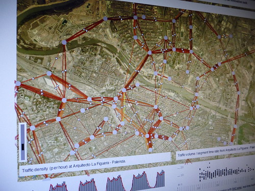
My experience in leading investigations that aim in extracting value from network data, exploratory data visualization is crucial to quickly recognize patterns and understand complex events. But as my projects involve diverse sets of professionals (e.g. ) being able to quickly sketch an interactive dashboard is a guarantee to have a common language that helps the different actors in asking better questions, getting better feedback from them and properly focusing the investigation (some call it visual thinking or to some extend predictive analytics). Ultimately, the use of plateforms such as Impure offer that opportunity to collect insights that give a project the upper hand in decision making. Moreover, the flexibility of a visual programming environment permit to go beyond the limited possibilities for design of GIS and statistical softwares while reducing the fast-prototyping time necessary to program specific interactive visualizations (e.g. see the animations of traffic density and flows in Zaragoza, Spain, based on real-time information) produced in a few hours with Impure).
Practically, in addition to quickly share a first exploratory analysis, environments such as Impure can simplify the practice of ethno-mining particularly to co-create data with participants of the field research (see Numbers Have Qualities Too: Experiences with Ethno-Mining).
Sketching a solution for the Louvre Museum with Impure (see the complete “Sketching with data” Flickr set)
Similar approach to “sketching with data”, Stamen that has for long been leading investigative data visualization projects generally we divide their process into three distinct phases—explore, build and refine. Based on their experience, they outlined some of their common assumptions about data visualization and recommendations for how to do this kind of work; one particularly relevant to the exploration (i.e. sketching) phase:
(19) Start and End With Questions
“Traditional statistical charts can be a good first step to generate questions, especially for getting an idea about the scope of a data set. Good questions to start with include “how many things do we have”, “what do we know about each thing”, “how do the things change over time”, “how many of each category of thing do we have”, “how many things are unique” and “how many things is each thing connected to”. I don’t believe that any visualization can answer all of these questions. The best visualization will answer some questions and prompt many more.”
Apparently, they are engaged in the a similar path as Bestiario, using a Knight News Challenge grant to build a series of tools to map and visualize data that is truly Internet-native and useful. Flexible and “internet-native” environments that make easier to work with information are also emerging in the data storage end of “sketching”, for instance with the Barcelona-based FluidDB.
At Barcelona Design Week, sharing an animation of the traffic flows in Zaragoza sketched with Impure using real-time data feed from BitCarrier.
Posted: November 9th, 2010 | Comments Off
While I was in Barcelona to attend the Barcelona Design Week, Josep Blat presented at the Foro de Movilidad de RedIRIS in Madrid the research themes and works developed with him as my PhD supervisor. RedIRIS provides highspeed Internet connectivity and other network facilities for the academia in Spain. On their invitation we shared some insights on the innovative exploitation of network data and their implications.
The presentation ran under the name “Networks, Sensor Networks, Human Sensors” (pdf).
Wires and their exploitation under new scrutiny
Why do I blog this: Publics institutions that make a living transporting bits also become curious on extracting value from network data. Our presentation complemented very well a day that had started with a demonstration of the use of animal digital traces in the Doñana natural park in the South West of Spain.
Thanks to Gerard Alcorlo i Bofill for the invitation!
Posted: October 22nd, 2010 | Comments Off
As part of the Barcelona Design Week, I participated to the Mobile Design Conference organized by dotopen.
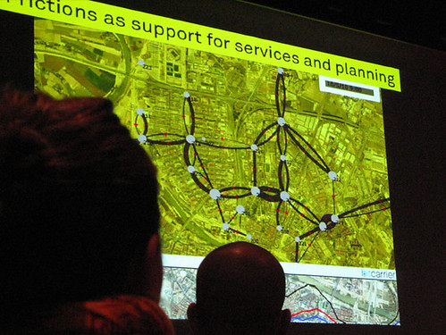
In my talk I discussed the notion of *frictions* that are inherent to the mundane life in the networked city. Frictions are all the *resistances* that people experience when using network infrastructures. Frictions are also the vigorous *rubbing* that sparkle data that we are not always aware off. Based on Lift Lab experience and investigation on the I argue that knowledge about frictions is a powerful, relevant and original resource to innovate in the networked cities. Here are the slides with my notes:
Cities, Networks, Frictions (pdf)

The networked city: Tyre, Lebanon.
Thanks to Rudy, Steffen and Carles for the inviations. It was a pure pleasure to share the stage with Kevin Slavin, Hugo Zaragoza and Matt Jones.
Posted: October 14th, 2010 | Comments Off
Next week I will be speaking at the Mobile Design Conference & Workshop around the theme of the “Networked City”. Particularly, I plan to share my experiences and methodologies to apprehend the hybridization of the physical and the digital in both contemporary urban environments and people practices.
Program organized by BCD in collaboration with dotopen. On October 21, 2010 at the Museum of Contemporary Art Barcelona (MACBA) during the Barcelona Design Week.
Morning Conference: Designing for the Networked City with keynotes from:
Kevin Slavin – Co-Founder and Chairman of AREA/CODE Entertainment
Matt Jones – Director of Design at BERG
Usham Haque – Director of HAQUE Design + Research Ltd
Fabien Girardin – Co-Founder of Lift Lab
Afternoon Workshop – MDC Lab: Co-Creating for the Networked City
This years’ Mobile Design Conference is proud to present the MDC Lab: a co-creation workshop lead by Liz Sanders with expert participation of the Mobile Design Conference speakers Kevin Slavin, Matt Jones, Usham Haque, Fabien Girardin. This workshop is aimed at professionals interested in the outlook and potential of Mobile Technologies and Urban Living.
Registration here
Why do I blog this: This talk provides an opportunity to clarify the communication around the Lab’s investigations and methodologies at the crossroads of the physical and the digital.